Logo Design

Forum for the creative side of the game development process: art, music, storyline, gameplay, concepts, etc. Any sort of relevant discussion is welcome here.

Moderator: PC Supremacists

User avatar
Sanshin77
Chaos Rift Regular
Chaos Rift Regular
Posts: 160
Joined: Tue Mar 10, 2009 9:36 am
Current Project: C++/SDL engine, zaActionWizardMagic game
Favorite Gaming Platforms: Xbox 360, Playstation 2, Nintendo DS, mac and PC
Programming Language of Choice: C++

Logo Design

Post by Sanshin77 »

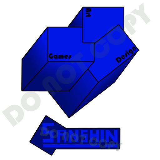
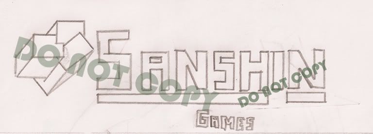
So Im thinking of getting a little more serious with a website(for my projects), so I started on a logo. Never done this kind of thing and would like some feedback here.

The scanned sketch:
Image

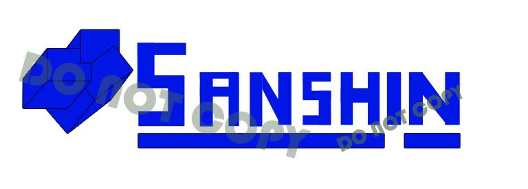
Main Logo:
Image

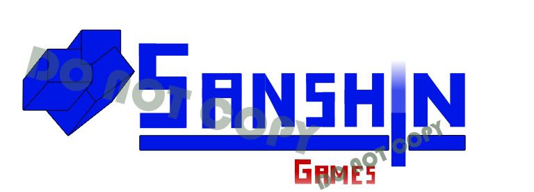
Games Logo(Section of the site):
Image

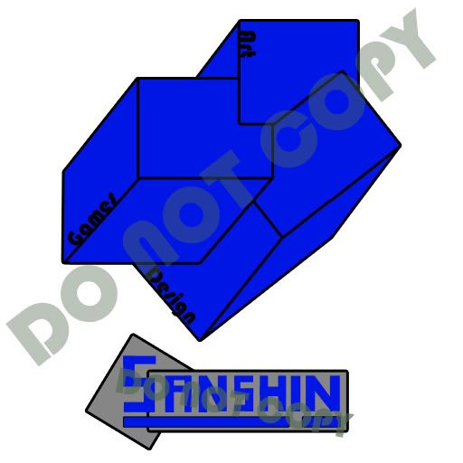
Square Shaped Logo:
Image


All of them are vector, so that's fine (I can scale them). I wondered if I should add shading. Any comments on the colors too would be greatly appreciated.
Check out videos of my C++ games as well as my "Amateur Game Dev" series over at
My YouTube Channel: http://www.youtube.com/user/Zanchill
User avatar
eatcomics
ES Beta Backer
ES Beta Backer
Posts: 2528
Joined: Sat Mar 08, 2008 7:52 pm
Location: Illinois

Re: Logo Design

Post by eatcomics »

The colors are good, then only problem I see is that the first one (above the one that says games) is a little too plain IMO, maybe just put "Home" under it or something (if it's a link, otherwise IDK)... But the rest look great ;)
Image
User avatar
MarauderIIC
Respected Programmer
Posts: 3406
Joined: Sat Jul 10, 2004 3:05 pm
Location: Maryland, USA

Re: Logo Design

Post by MarauderIIC »

I like the blue and gray part of the bottommost logo the best. Something's wrong with your cubes. Maybe all the lines aren't parallel?
I realized the moment I fell into the fissure that the book would not be destroyed as I had planned.
User avatar
Netwatcher
Chaos Rift Junior
Chaos Rift Junior
Posts: 378
Joined: Sun Jun 07, 2009 2:49 am
Current Project: The Awesome Game (Actual title)
Favorite Gaming Platforms: Cabbage, Ground beef
Programming Language of Choice: C++
Location: Rehovot, Israel

Re: Logo Design

Post by Netwatcher »

Image

The lowest and left cubes seems to be expanding to the distance O_O like a trapezoid.
"Programmers are the Gods of their tiny worlds. They create something out of nothing. In their command-line universe, they say when it’s sunny and when it rains. And the tiny universe complies."
-Derek Powazek, http://powazek.com/posts/1655

blip.fm DJ profile - http://blip.fm/Noobay
current code project http://sourceforge.net/projects/vulcanengine/
User avatar
RyanPridgeon
Chaos Rift Maniac
Chaos Rift Maniac
Posts: 447
Joined: Sun Sep 21, 2008 1:34 pm
Current Project: "Triangle"
Favorite Gaming Platforms: PC
Programming Language of Choice: C/C++
Location: UK
Contact:

Re: Logo Design

Post by RyanPridgeon »

I like the blue and gray logo, but I dont like the cubes idea, or the thick black outlines everywhere.
Ryan Pridgeon
C, C++, C#, Java, ActionScript 3, HaXe, PHP, VB.Net, Pascal
Music | Blog
User avatar
OrinCreed
Chaos Rift Regular
Chaos Rift Regular
Posts: 105
Joined: Sat Apr 11, 2009 8:31 pm
Location: NJ
Contact:

Re: Logo Design

Post by OrinCreed »

Ok I'm no expert with logo design but I thought I might give you a critique. Feel free to tell me off. :)

Ok so I like the idea you have with the boxes housing the 3 different fields. I would suggest keeping the boxes the same size unless you want emphasis on one aspect over the others. The bottom right hand box also appear to be going off to different vanishing point than the other two boxes, so you might want to look at that.

Another thing you might want to reconsider is the blue text on the gray field. When I was in school my graphics design and web design teachers would rip someone a new asshole for doing this. The reason being is that the Blue and gray begin to bleed together, more so as the text shrinks, making it difficult to read. You could always give the text a black stroke if you are set on the color choice though. It will help break the colors apart.

More on colors. Having each box as one uniform color might be a bit drab. This will sound silly but people seem to have a hard on for primary colors in their logos. I would recommend coloring each box with it's own distinct color to break things up. You could do the primary thing or just find colors that really work for you.

I really liked one of the first logos you posted. The one where the "I" bisects the underline and gradients out at the top. That one has a cool feel to it.

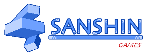
Ok so here is something I tossed together using my limited experience doing logo work. I took all the ideas i liked from you logo and tried to apply some of my own suggestions. I used a generic font for the example but you could always toss in your font style. Feel free to use any or all of the ideas, or just ignore me. :) Hope I was a little helpful.

Image
User avatar
Innerscope
Chaos Rift Junior
Chaos Rift Junior
Posts: 200
Joined: Mon May 04, 2009 5:15 pm
Current Project: Gridbug
Favorite Gaming Platforms: NES, SNES
Programming Language of Choice: Obj-C, C++
Location: Emeryville, CA
Contact:

Re: Logo Design

Post by Innerscope »

I agree with Marauder and Netwatcher on the perspective issue. I think the logo needs to be more defined by either shading the cubes or giving it a more distinct shape. I like that you're creating the letters, but I think they should be more evenly spaced and sized. (both the "N"'s are different sizes)
Here's a crappy mockup I did: (note: I'm using skia for the type and I rendered the cubes in a 3D modeling program)
Image
I don't really like the way I did my cubes, but you can see that the shading helps the aesthetics of the image.

[Edit: I just saw OrinCreed's design, I think I like the flat squares better. The "I" bisecting the line is also nice.]
Current Project: Gridbug
Website (under construction) : http://www.timcool.me
User avatar
OrinCreed
Chaos Rift Regular
Chaos Rift Regular
Posts: 105
Joined: Sat Apr 11, 2009 8:31 pm
Location: NJ
Contact:

Re: Logo Design

Post by OrinCreed »

Innerscope wrote:I agree with Marauder and Netwatcher on the perspective issue. I think the logo needs to be more defined by either shading the cubes or giving it a more distinct shape. I like that you're creating the letters, but I think they should be more evenly spaced and sized. (both the "N"'s are different sizes)
Here's a crappy mockup I did: (note: I'm using skia for the type and I rendered the cubes in a 3D modeling program)
Image
I don't really like the way I did my cubes, but you can see that the shading helps the aesthetics of the image.

[Edit: I just saw OrinCreed's design, I think I like the flat squares better. The "I" bisecting the line is also nice.]


The blue monochrome is great. It really works well and like you said gives some powerful contrast to the OP's cube design. I also like the splash of red as it compliments the blue nicely. In fact I liked it so much I had to apply it to my example logo. lol. The Red games might be a little much in my design since games is already mentioned once in the cubes.


Image
Last edited by OrinCreed on Sun Jul 19, 2009 12:16 pm, edited 1 time in total.
User avatar
Innerscope
Chaos Rift Junior
Chaos Rift Junior
Posts: 200
Joined: Mon May 04, 2009 5:15 pm
Current Project: Gridbug
Favorite Gaming Platforms: NES, SNES
Programming Language of Choice: Obj-C, C++
Location: Emeryville, CA
Contact:

Re: Logo Design

Post by Innerscope »

OrinCreed wrote:Image
Yea, that's looking good.
I concur on the games text, it seems forced/being emphasized too much... Maybe a custom font for Sashin as well.
Other than that, I think this is a good mock-up for Sanshin to work with.
Current Project: Gridbug
Website (under construction) : http://www.timcool.me
User avatar
OrinCreed
Chaos Rift Regular
Chaos Rift Regular
Posts: 105
Joined: Sat Apr 11, 2009 8:31 pm
Location: NJ
Contact:

Re: Logo Design

Post by OrinCreed »

Image

That red "games" was bugging me so I removed it. I agree a custom (or at least more interesting font) would improve it. I just used a generic for the example. I wonder if the OP still checks this thread.
User avatar
Sanshin77
Chaos Rift Regular
Chaos Rift Regular
Posts: 160
Joined: Tue Mar 10, 2009 9:36 am
Current Project: C++/SDL engine, zaActionWizardMagic game
Favorite Gaming Platforms: Xbox 360, Playstation 2, Nintendo DS, mac and PC
Programming Language of Choice: C++

Re: Logo Design

Post by Sanshin77 »

Wow, thanks for all the replies, I almost forgot this thread ( got finished on my C++ book though:) )

Ive read every reply, and will give updates when I have something done...


RyanPridgeon wrote:I like the blue and gray logo, but I dont like the cubes idea, or the thick black outlines everywhere.
Im going with all the cubes, have taken away some outlines tho...
Netwatcher wrote:The lowest and left cubes seems to be expanding to the distance O_O like a trapezoid.
I tried fixing that, look at the update below.
OrinCreed wrote:Ok I'm no expert with logo design but I thought I might give you a critique. Feel free to tell me off. :)
[...]
Another thing you might want to reconsider is the blue text on the gray field. When I was in school my graphics design and web design teachers would rip someone a new asshole for doing this. The reason being is that the Blue and gray begin to bleed together, more so as the text shrinks, making it difficult to read. You could always give the text a black stroke if you are set on the color choice though. It will help break the colors apart.
[...]
Ok so here is something I tossed together using my limited experience doing logo work. I took all the ideas i liked from you logo and tried to apply some of my own suggestions. I used a generic font for the example but you could always toss in your font style. Feel free to use any or all of the ideas, or just ignore me. :) Hope I was a little helpful.
Thanks! You're certainly an expert compared to me, I looked at some of the coloring advices and tried to improve it.
Innerscope wrote:I like that you're creating the letters, but I think they should be more evenly spaced and sized. (both the "N"'s are different sizes)
I'll look at it, but then I kinda want the letters to look home-made(and un-proffesional).


The design is not done yet, but the update is below(and Im going to bed).
Last edited by Sanshin77 on Sun Jul 19, 2009 8:03 pm, edited 2 times in total.
Check out videos of my C++ games as well as my "Amateur Game Dev" series over at
My YouTube Channel: http://www.youtube.com/user/Zanchill
User avatar
Sanshin77
Chaos Rift Regular
Chaos Rift Regular
Posts: 160
Joined: Tue Mar 10, 2009 9:36 am
Current Project: C++/SDL engine, zaActionWizardMagic game
Favorite Gaming Platforms: Xbox 360, Playstation 2, Nintendo DS, mac and PC
Programming Language of Choice: C++

Re: Logo Design

Post by Sanshin77 »

I did some of the stuff suggested, and I also added replies to last post.

Updated:
Image
Check out videos of my C++ games as well as my "Amateur Game Dev" series over at
My YouTube Channel: http://www.youtube.com/user/Zanchill
User avatar
cal3
Chaos Rift Newbie
Chaos Rift Newbie
Posts: 2
Joined: Thu Jul 23, 2009 3:30 pm
Current Project: mixture
Favorite Gaming Platforms: PC
Programming Language of Choice: C++

Re: Logo Design

Post by cal3 »

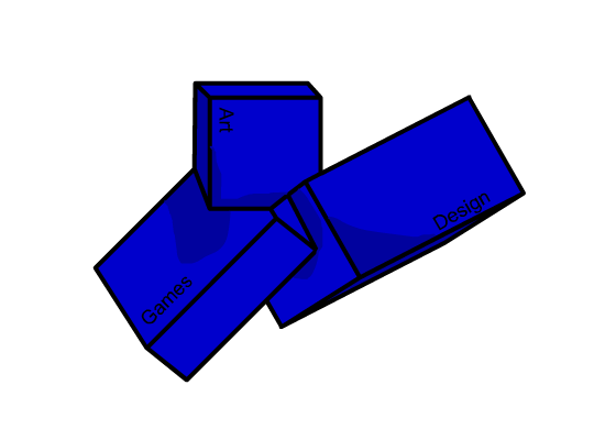
To tell you the truth, I don't like that gradient, it looks cheap as if you just filled it with a click, choose some nice blues from a palette, I'm sure it would look better :)
User avatar
Sanshin77
Chaos Rift Regular
Chaos Rift Regular
Posts: 160
Joined: Tue Mar 10, 2009 9:36 am
Current Project: C++/SDL engine, zaActionWizardMagic game
Favorite Gaming Platforms: Xbox 360, Playstation 2, Nintendo DS, mac and PC
Programming Language of Choice: C++

Re: Logo Design

Post by Sanshin77 »

cal3 wrote:To tell you the truth, I don't like that gradient, it looks cheap as if you just filled it with a click, choose some nice blues from a palette, I'm sure it would look better :)
I kinda agree myself, but Im not working on the website for now, so I havent done anything with these logos.
Check out videos of my C++ games as well as my "Amateur Game Dev" series over at
My YouTube Channel: http://www.youtube.com/user/Zanchill
User avatar
Pickzell
Chaos Rift Junior
Chaos Rift Junior
Posts: 233
Joined: Sat May 16, 2009 10:21 am

Re: Logo Design

Post by Pickzell »

I should have kept shading straight, forgot to write sanshin, the point where all three connect break apart into subspace.
I did this in Flash MX, excuse the suck, I haven't done anything in vector since early 08.
Image
download, with alpha image and .fla here.

And just for you
Image (Image)
I'm an altogether bad-natured Cupid.
Post Reply