Page 2 of 2
Re: Logo Design
Posted: Sat Jul 25, 2009 7:13 am
by Sanshin77
As said Ill get back to the logo design when I start working on the site again, and Im kinda stubborn so Im 99% sure I will keep the main design as it is.
Oh and I don't want shading on my sprite

Re: Logo Design
Posted: Sat Jul 25, 2009 7:53 am
by Netwatcher
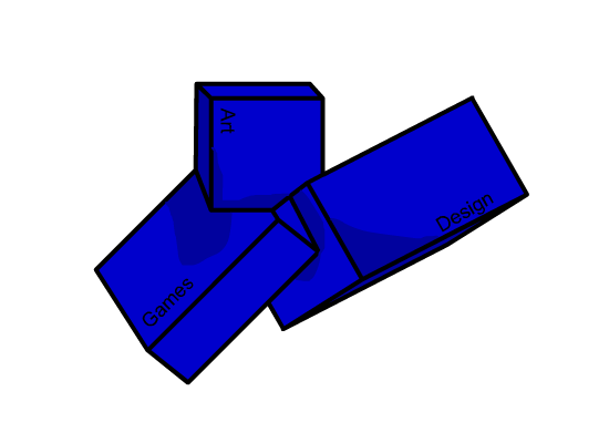
Pickzell wrote:I should have kept shading straight, forgot to write sanshin, the point where all three connect break apart into subspace.
I did this in Flash MX, excuse the suck, I haven't done anything in vector since early 08.

download, with alpha image and .fla
here.
Soft shadows? more like moist shadows, it looks like the cubes are wet... seriously.
Re: Logo Design
Posted: Sat Jul 25, 2009 2:57 pm
by Pickzell
Netwatcher wrote:Pickzell wrote:I should have kept shading straight, forgot to write sanshin, the point where all three connect break apart into subspace.
I did this in Flash MX, excuse the suck, I haven't done anything in vector since early 08.

download, with alpha image and .fla
here.
Soft shadows? more like moist shadows, it looks like the cubes are wet... seriously.
You pretty much rephrased what I already said.

