Forum for the creative side of the game development process: art, music, storyline, gameplay, concepts, etc. Any sort of relevant discussion is welcome here.
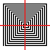
Well, I took two hours of my life making this. It's meant to be the logo I will use for all of my games("company" logo, and naturally each game would have it's seperate logo, but they will all share this in common).
Should be simpler. It may cause a headache to certain people. I'd have less density to the swirl, like five or six lines vertically and horizontally, and round the corners. Also, the crosshairs should be bolder I think. Basically make it noticeable from afar. Right now it looks like one of those funky square barcodes you find on packages and stuff.
This was constructive criticism, BTW. I don't hate it, but I feel it needs tweaking.
I would think so. I'd suggest however thick you make the lines of the swirl you also make the white part as well. So, if you have five pixel lines, you'd have five pixel whitespace. I'd say make everything simple and bold so that it stands out.
Thats what I was thinking. A brush with no antialiasing, so it doesn't look so bleh. Maybe change the color of the swirl, and make the crosshairs less sharp. Plus add in a circle for more effect. And I'm going to make the pixels a larger size.
MarauderIIC wrote:You could use the head from the dude on your banner =)
Only if it's his own artwork.
From the amateurish MS Paint text added on top, I'm guessing he didn't make that picture. ;P
Simple logos are best. I think mainly look at other company logos and see what sort of stuff they have. I don't know if you're going to call your stuff "JaxDragon" games or what, but you might think about a logo that has something to do with a dragon. Or Jax.